


%20--%3e%3csvg%20version='1.1'%20id='svg768'%20xml:space='preserve'%20width='682.66669'%20height='682.66669'%20viewBox='0%200%20682.66669%20682.66669'%20xmlns='http://www.w3.org/2000/svg'%20xmlns:svg='http://www.w3.org/2000/svg'%3e%3cdefs%20id='defs772'%3e%3cclipPath%20clipPathUnits='userSpaceOnUse'%20id='clipPath782'%3e%3cpath%20d='M%200,512%20H%20512%20V%200%20H%200%20Z'%20id='path780'%20/%3e%3c/clipPath%3e%3c/defs%3e%3cg%20id='g774'%20transform='matrix(1.3333333,0,0,-1.3333333,0,682.66667)'%3e%3cg%20id='g776'%3e%3cg%20id='g778'%20clip-path='url(%23clipPath782)'%3e%3cg%20id='g784'%20transform='translate(452,20)'%3e%3cpath%20d='m%200,0%20h%20-392%20c%20-22.092,0%20-40,17.909%20-40,40%20v%20353.333%20c%200,22.092%2017.908,40%2040,40%20H%200%20c%2022.092,0%2040,-17.908%2040,-40%20V%2040%20C%2040,17.909%2022.092,0%200,0%20Z'%20style='fill:none;stroke:%23000000;stroke-width:40;stroke-linecap:round;stroke-linejoin:round;stroke-miterlimit:10;stroke-dasharray:none;stroke-opacity:1'%20id='path786'%20/%3e%3c/g%3e%3cg%20id='g788'%20transform='translate(492,334.6665)'%3e%3cpath%20d='M%200,0%20H%20-472'%20style='fill:none;stroke:%23000000;stroke-width:40;stroke-linecap:round;stroke-linejoin:round;stroke-miterlimit:10;stroke-dasharray:none;stroke-opacity:1'%20id='path790'%20/%3e%3c/g%3e%3cg%20id='g792'%20transform='translate(138,492)'%3e%3cpath%20d='M%200,0%20V%20-78.667'%20style='fill:none;stroke:%23000000;stroke-width:40;stroke-linecap:round;stroke-linejoin:round;stroke-miterlimit:10;stroke-dasharray:none;stroke-opacity:1'%20id='path794'%20/%3e%3c/g%3e%3cg%20id='g796'%20transform='translate(374,492)'%3e%3cpath%20d='M%200,0%20V%20-78.667'%20style='fill:none;stroke:%23000000;stroke-width:40;stroke-linecap:round;stroke-linejoin:round;stroke-miterlimit:10;stroke-dasharray:none;stroke-opacity:1'%20id='path798'%20/%3e%3c/g%3e%3cg%20id='g800'%20transform='translate(118.333,227.3335)'%3e%3cpath%20d='M%200,0%20H%2039.334'%20style='fill:none;stroke:%23000000;stroke-width:40;stroke-linecap:round;stroke-linejoin:round;stroke-miterlimit:10;stroke-dasharray:none;stroke-opacity:1'%20id='path802'%20/%3e%3c/g%3e%3cg%20id='g804'%20transform='translate(236.333,227.3335)'%3e%3cpath%20d='M%200,0%20H%2039.334'%20style='fill:none;stroke:%23000000;stroke-width:40;stroke-linecap:round;stroke-linejoin:round;stroke-miterlimit:10;stroke-dasharray:none;stroke-opacity:1'%20id='path806'%20/%3e%3c/g%3e%3cg%20id='g808'%20transform='translate(354.333,227.3335)'%3e%3cpath%20d='M%200,0%20H%2039.334'%20style='fill:none;stroke:%23000000;stroke-width:40;stroke-linecap:round;stroke-linejoin:round;stroke-miterlimit:10;stroke-dasharray:none;stroke-opacity:1'%20id='path810'%20/%3e%3c/g%3e%3cg%20id='g812'%20transform='translate(118.333,128)'%3e%3cpath%20d='M%200,0%20H%2039.334'%20style='fill:none;stroke:%23000000;stroke-width:40;stroke-linecap:round;stroke-linejoin:round;stroke-miterlimit:10;stroke-dasharray:none;stroke-opacity:1'%20id='path814'%20/%3e%3c/g%3e%3cg%20id='g816'%20transform='translate(236.333,128)'%3e%3cpath%20d='M%200,0%20H%2039.334'%20style='fill:none;stroke:%23000000;stroke-width:40;stroke-linecap:round;stroke-linejoin:round;stroke-miterlimit:10;stroke-dasharray:none;stroke-opacity:1'%20id='path818'%20/%3e%3c/g%3e%3cg%20id='g820'%20transform='translate(354.333,128)'%3e%3cpath%20d='M%200,0%20H%2039.334'%20style='fill:none;stroke:%23000000;stroke-width:40;stroke-linecap:round;stroke-linejoin:round;stroke-miterlimit:10;stroke-dasharray:none;stroke-opacity:1'%20id='path822'%20/%3e%3c/g%3e%3c/g%3e%3c/g%3e%3c/g%3e%3c/svg%3e)
<Teleport> 컴포넌트는 말그대로 특정 DOM을 외부로 순간이동(teleport) 시켜주는 기능을 가졌습니다. 보통은 DOM을 바꿔야할 일은 없지만 팝업창과 같이 갑자기 최상단으로 나와야하는 것들에 있어 필요한 기능입니다. 왜 그런지 자세히 알아볼까요?
Teleport
Teleport 기능은 이미 이름부터 감을 잡았을 것이기 때문에 왜 필요한지부터 설명하면 좋을 것 같습니다.
Teleport가 필요한 이유 1
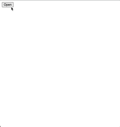
예를 들어 다음과 같은 modal 컴포넌트를 만들었다고 해보겠습니다.
      <template>
  <div class="modal-wrapper">
    <button @click="open = true">Open</button>
    <div v-if="open" class="modal">
      <p>Modal 내용</p>
      <button @click="open = click">Close</button>
    </div>
  </div>
</template>

<script setup>
import { ref } from "vue";
const open = ref(false);
</script>
open 이라는 값을 통해 modal 클래스 가진 div를 나타났다 사라지게 하는 정도의 코드입니다. 최상단에 떠야하는 modal 창이니 fixed를 이용해서 화면 중앙에 뜨도록 하게 해보겠습니다.
      <style>
.modal {
  position: fixed;
  z-index: 10000;
  top: 50%;
  left: 50%;
  width: 300px;
  height: 300px;
  background-color: blue;
  color: white;
  transform: translate(-50%, -50%);
}
</style>
이제 이 컴포넌트를 App.vue에 추가해서 잘 되는지 확인해봅시다.
      <script setup>
import MyModal from "./components/MyModal.vue";
</script>

<template>
  <div class="demo">
    <MyModal />
  </div>
</template>
일단 잘 뜨는 거 같습니다. 이제 간단히 콘텐츠 영역도 만들어보겠습니다.
      <template>
  <div class="demo">
    <div class="rect"></div>
    <MyModal />
    <div class="content">다른 내용</div>
  </div>
</template>

<style>
.rect {
  position: absolute;
	z-index: 1;
  top: 0;
  left: 0;
  width: 100px;
  height: 100px;
  background-color: lightcoral;
}

.content {
  position: relative;
  z-index: 2;
  width: 500px;
  height: 500px;
  transform: translateY(-5px);
  background-color: gray;
  color: white;
}
</style>
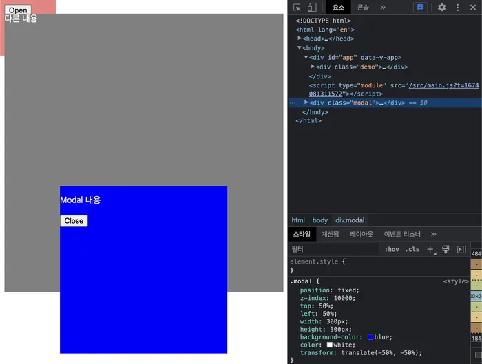
다음과 같이 2개의 박스를 추가했습니다.
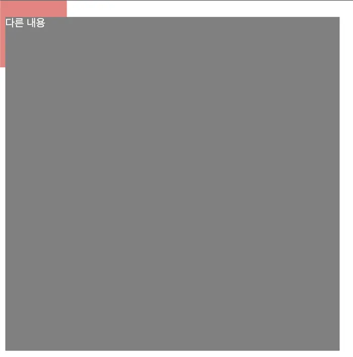
중요한건 버튼이 안보이죠! 회색박스는 가리지 않으면서 분홍박스보다는 위에 버튼이 있게 구현하고 싶은 상황입니다. 분홍박스는 z-index:0, 회색박스는 z-index:2 이기 때문에 modal-wrapper 의 z-index 값을 1로 하기로 했습니다.
      .modal-wrapper {
  position: relative;
  z-index: 1;
}
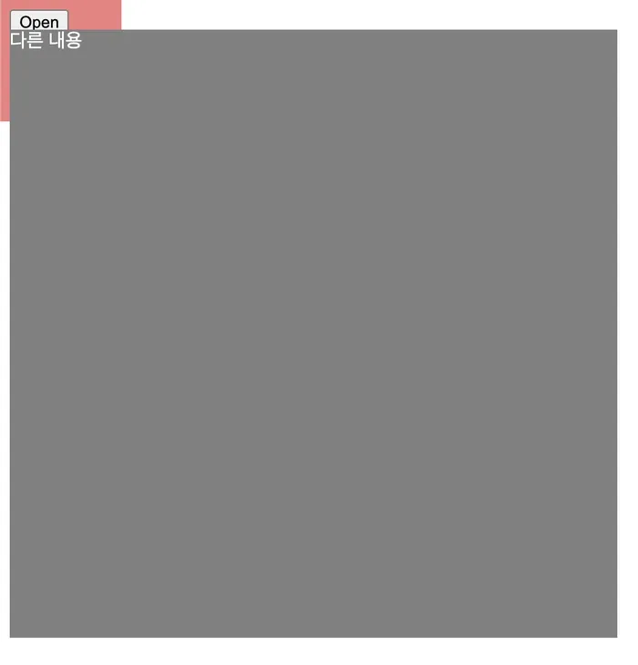
이제 Open 을 눌러 Modal을 띄우면 다음과 같이 나타나게 됩니다.
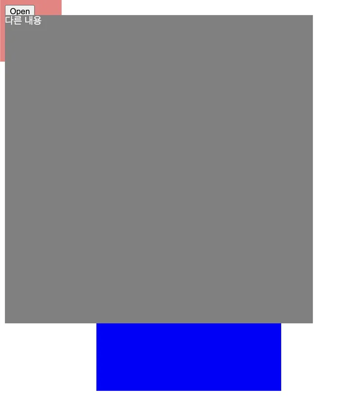
modal-wrapper의 z-index가 회색 박스보다 낮기 때문에 아무리 파란박스의 z-index 값을 올려도 회색박스보다 위에 있을 수 없게 됩니다.
다른 해결 방법도 있지만 Teleport는 이러한 상황에서 저 파란 박스를 modal-wrapper에서 벗어나게 배치해줌으로써 이런 문제 상황을 해결해줍니다.
      <template>
  <div class="modal-wrapper">
    <button @click="open = true">Open</button>

		<!-- Teleport 컴포넌트 추가!! -->
    <Teleport to="body">
      <div v-if="open" class="modal">
        <p>Modal 내용</p>
        <button @click="open = click">Close</button>
      </div>
    </Teleport>
  </div>
</template>
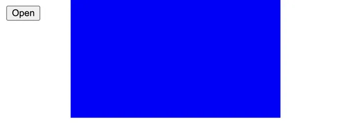
파란박스가 회색박스보다 위에 있을 수 있는 이유는 modal은 더이상 modal-wrapper안이 아닌 body의 최하단으로 내려갔기 때문입니다. 따라서 modal-wrapper의 z-index에 영향을 받지 않고 자신의 z-index:10000 값에 맞게 제일 위에 있게 됩니다.
Teleport가 필요한 이유 2
위처럼 복잡한 이유 말고 간단한 이유도 한 가지 있습니다. fixed를 썼다고 해도 만약에 부모 태그에서 transform, filter, perspective를 썼다면 fixed가 적용되지 않습니다.
박스들은 지우고 modal-wrapper에 transform을 살짝 적용해보겠습니다
      <style>
.modal-wrapper {
  transform: translate(1px);
}
결과를 보니 left는 되는 거 같은데 top이 적용이 안되네요.
to 속성
Teleport에서 속성으로 to를 지정해주는데요. CSS 선택자로 보시면 됩니다. 이 때 주의할 점은 반드시 Teleport 컴포넌트가 마운트 되기 전에 to가 지정한 DOM은 미리 마운트 되어 있어야한다는 점입니다.
<Teleport to=".my-modal-group">
	...
</Teleport>
my-modal-group 클래스를 가진 태그가 마운트되지 않거나 없다면 다음과 같은 에러를 만나게 됩니다.

컴포넌트의 로직은 그대로
잘 보시면 body로 태그가 이동했음에도 open이라는 값을 통해 modal이 열고 닫힐 수 있습니다. 그 이유는 여전히 컴포넌트의 로직에서는 벗어나지 않았기 때문입니다. 그 덕에 자유롭게 기존처럼 필요한 로직을 넣어서 사용하면 됩니다. 당연히 부모 컴포넌트로부터 prop을 받거나 이벤트 emit도 가능하다는 뜻입니다!
Teleport 순서
Modal 창은 보통 하나가 아니죠. 여러 군데에서 Teleport를 사용할 가능성이 높습니다. 그리고 to가 같을 확률도 높죠.
      <Teleport to="#modals">
  <div>A</div>
</Teleport>
<Teleport to="#modals">
  <div>B</div>
</Teleport>
이 경우 먼저 마운트 된 순서대로 push 된다고 보시면 됩니다.
      <div id="modals">
  <div>A</div>
  <div>B</div>
</div>
상황에 따라 disable
Teleport에는 disabled 속성도 있습니다.
      <Teleport :disabled="isMobile">
  ...
</Teleport>
예를 들면 데스크톱하고 모바일에서 다른 디자인으로 구현되어야하는 경우에 쓰입니다. 데스크톱에서는 Modal 창을 띄워야하지만, 모바일에서는 바로 띄워지게 해두는 경우가 한 예입니다.